4 Introduction to ggplot
This chapter introduces the ggplot library in R. We will
cover some basic data visualization techniques essential for
effectively communicating descriptive statistics. For
example, we will see how to make scatter plots, bar plots,
box plots, histograms, and violin plots, all of which are
common and useful when analyzing and presenting data.
Data visualisation is a core component of modern descriptive
statistics and it is essential that we become proficient at
collecting data, assembling it into csv-style formats,
piping it into R, and inspecting it using plots. There are
numerous methods to generate plots using R, but in this
unit, we will focus exclusively on first representing our
data as a data.table and then using ggplot to make
plots. Note that many of the visualisations we will
demonstrate below look best when we have lots of data, so
lets make a big toy example now.
# define example data with more observations
x1 <- runif(100)
x2 <- runif(100)
x3 <- runif(100)

# create a wide format data.table
d_wide <- data.table(x1, x2, x3)

# convert to a long format data.table
d_long <- melt(d_wide, measure.vars=c('x1', 'x2', 'x3'))4.2 geom_point
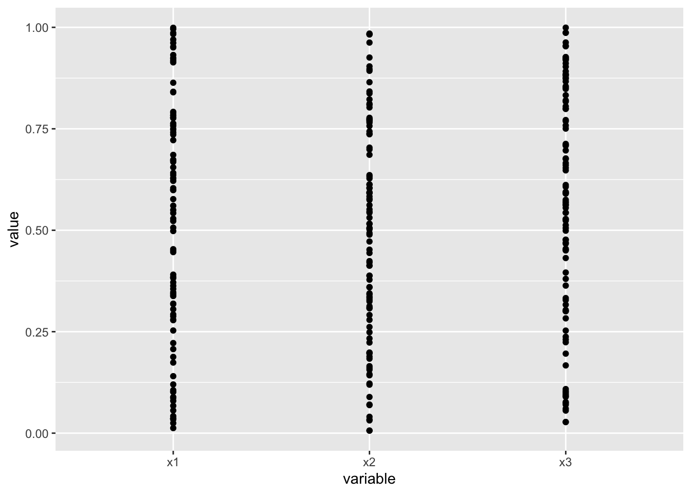
Perhaps the most straightforward approach to visualising data is simply to plot points for each observation in your sample.
4.3 geom_boxplot
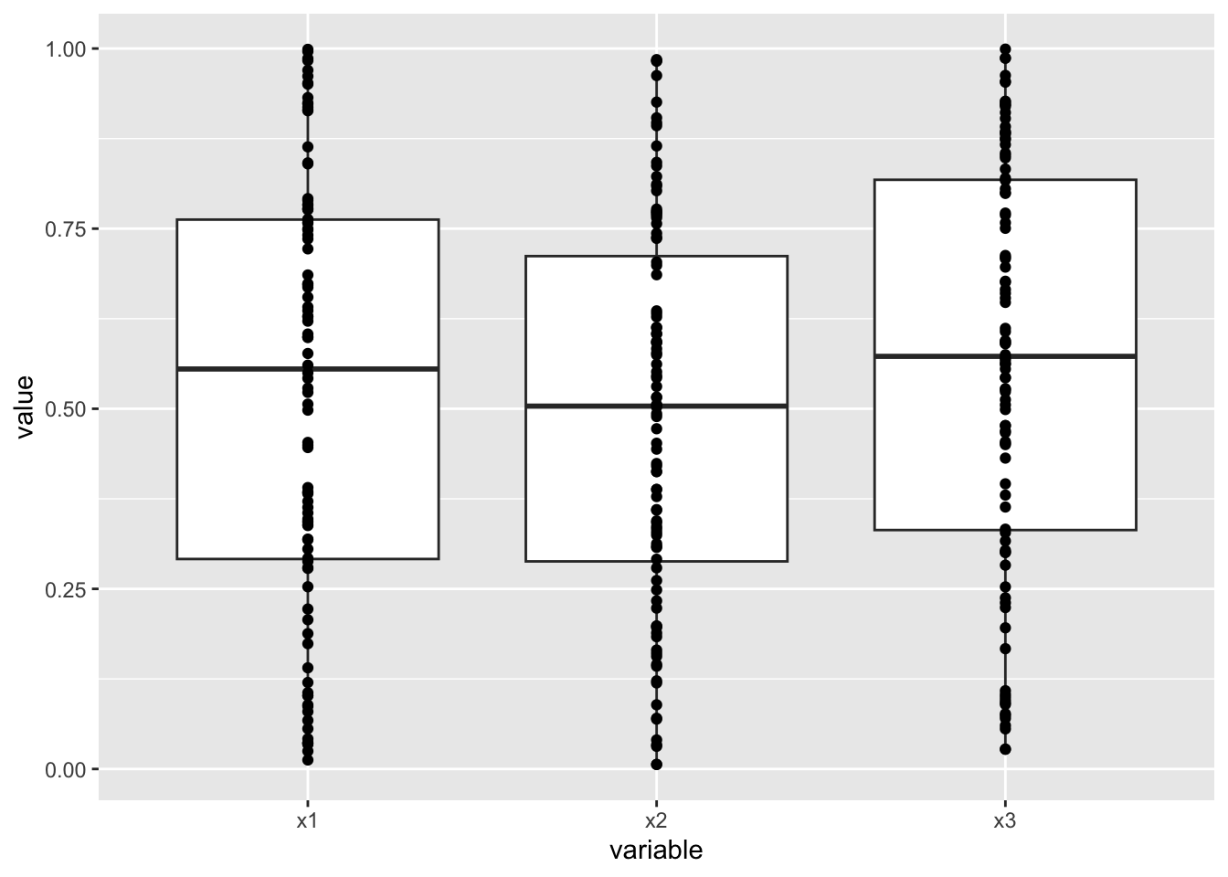
Box plots give a summary of how your data is distributed by visually marking out the median value as well as the 25th to the 75th percentile. The idea is to concisely illustrate where the majority of the data fall.
Whiskers will typically extend from the ends of the box to indicate the more extreme end of your data, and very extreme data points will often be plotted individually. This aspect of box plots doesn’t have as strong a convention as the rest, so it’s important to read the documentation to be sure you are plotting what you think you are plotting.
I often find that it can be quite nice to use both
geom_point and geom_box in conjunction as follows.
4.4 geom_violin
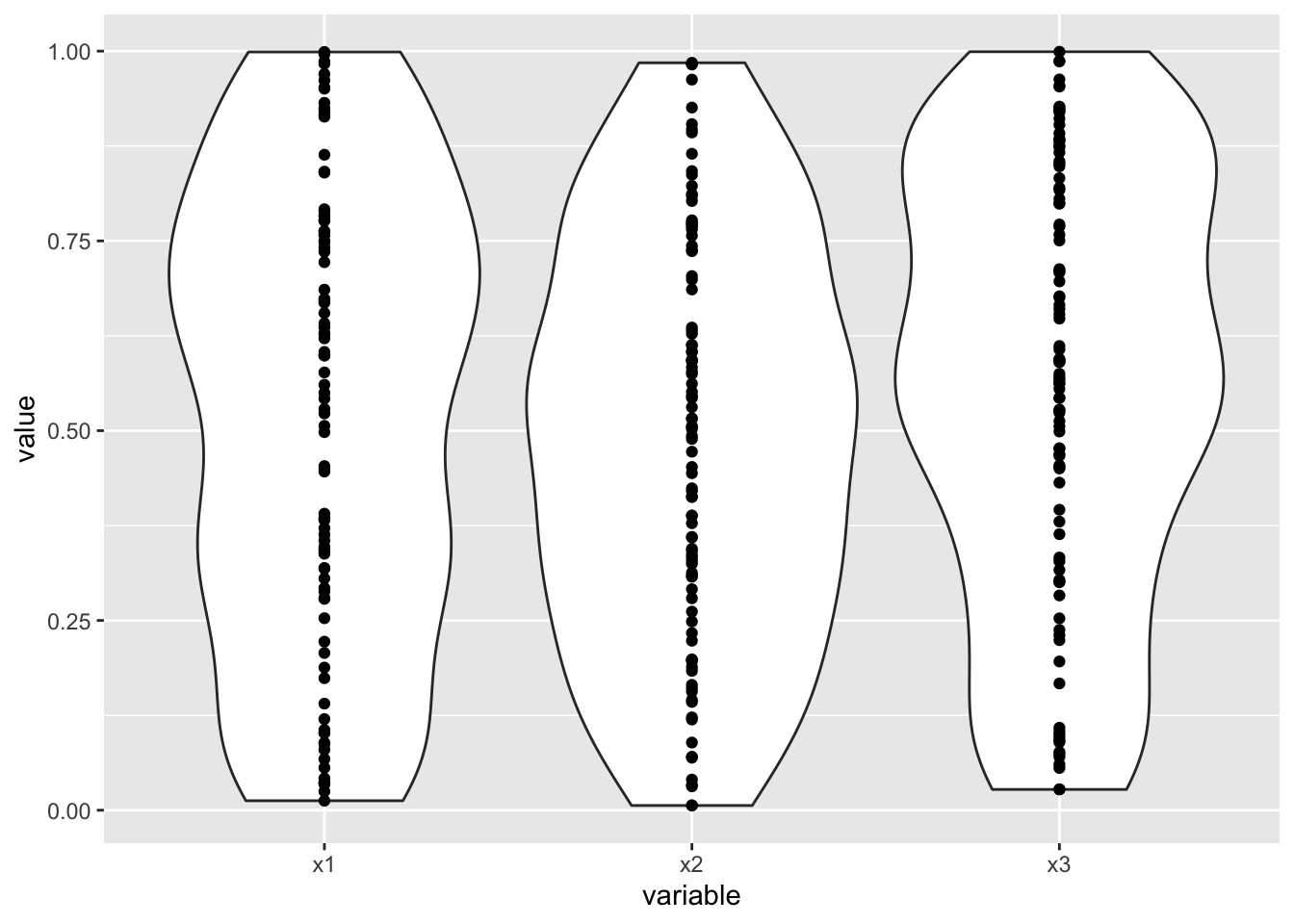
Violin plots are similar to box plots, except rather than represent your data in terms of percentiles, it attempts to give you a continuous estimate of how much our your data fall along the range of possible values. As with box plots, I often like to overlay individual points.
4.5 geom_hist
A histogram attempts to illustrate how data is distributed by grouping data points into a set number of bins, and plotting a bar with height equal to the number of points in each bin.
If you have a lot of data, this method can work really well
and convey lots of great information. With a smaller data
set — like the toy rat example that we are currently using
— it only works okay. In any case, working with
histograms can involve a bit of tweaking to get things to
look nice. For example, you can control how many bins are
used and how big or small each bin is by using the bins
and breaks argument.
ggplot(data=d_long, aes(x=value, fill=variable)) +
  geom_histogram(bins = 10) +
  facet_wrap(~variable)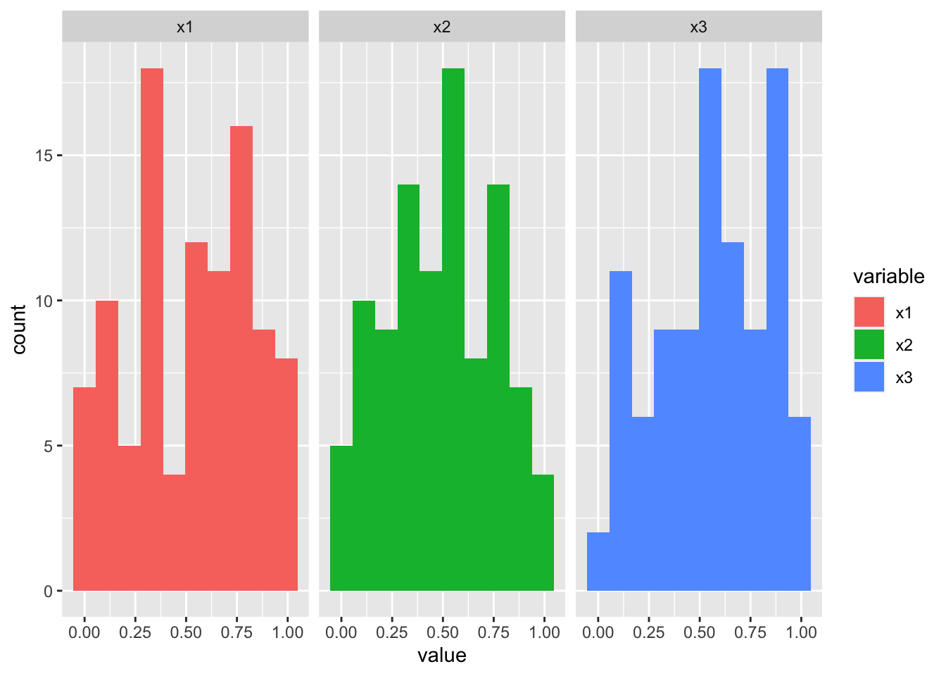
4.6 geom_bar
Bar plots are among the most common plots you will encounter as you navigate pretty much any scientific field. They throw away all information about how your data is distributed, and instead report only on the average values (unless error bars are included).
There are many ways to use ggplot and geom_bar to make a
bar plot. A good way to start is to first create a
data.table that contains only the average values that you
want to be represented by the bar heights:
d_mean = d_long[, .(var_mean = mean(value)), .(variable)]
ggplot(data=d_mean, aes(x=variable, y=var_mean)) +
  geom_bar(stat='identity')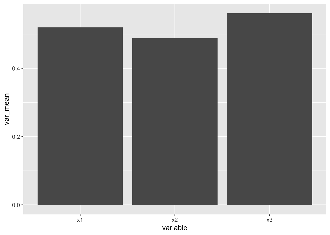
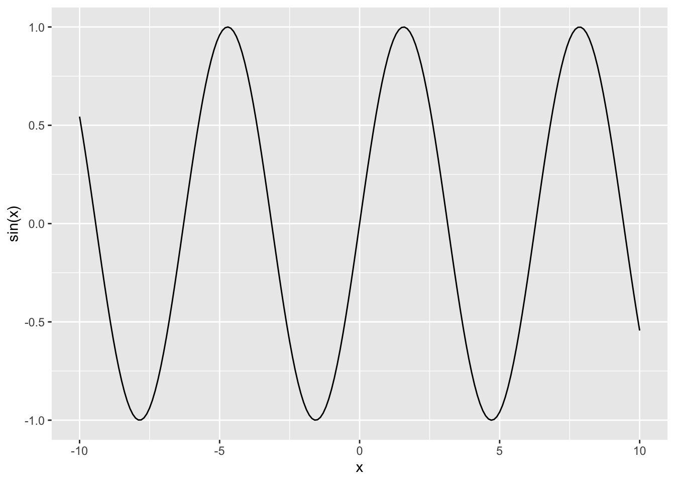
4.7 geom_line
Of course, in certain circumstance, we might want to make a
simple line plot. This is also easy to achieve with
ggplot, but to demonstrate its use, we will need a
different example data set.
x <- seq(-10, 10, 0.1)
y <- sin(x)
d <- data.table(x, y)

ggplot(data=d, aes(x=x, y=y))+
  geom_line() +
  ylab('sin(x)')